ZTN WEBSITE
Role in Project:
Lead UX designer
UX Researcher
Goal of Project:
Design a website for the rap group that is trustworthy and secure that allows users to listen to music while browsing their website/shopping.
Homepage includes floating logo of group
Target Audience:
Users who shop online at least three times a month and use music streaming services
Key Challenges
Time constraints: Entire project was completed in two weeks
Combining a music player and a shopping site all on one website
Creating a media player that you could control throughout the entire user journey
Pain Points:
Paint point 1:
Other websites don’t provide an engaging experience for their user when it comes to shopping or viewing artists.
Paint point 2:
Other websites will sell artists’ merchandise for higher than the original price. Making it unaffordable for certain users.
Paint Point 3:
Other websites don’t provide security or proof that their site is legit and not a scam.
Persona
Problem Statement
Mikayla is a dedicated fan who needs an easy way to both listen to music and buy merchandise from her favorite rap group because she doesn’t trust other sites that claim to do the same thing.
User Journey
I created a user journey map of Mikayla’s using the site to help identify possible pain points and improvement opportunities.
Site Map
The goal here was to make sure the website navigation is simple for all users and that they are able to go to any subcategory no matter what section of the website they are on.
Paper Wireframes
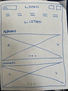
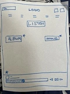
This is the paper wireframe for the listening section of the website. I went through four iterations of the wireframe before creating the final paper wireframe. The blue stars indicate what design elements I liked from each iteration and what I would use for the final paper wireframe. I also included the mobile version as well since it would become a responsive website for the rap group.
Research Conducted
1 unmoderated remote usability study
5 participants, between ages 18-30, users who use online shopping at least three times a month and stream music at least 3 days a week
Asked users to complete an order on the website while also looking at the music selection for the music player
Digital Wireframe: Usability Study
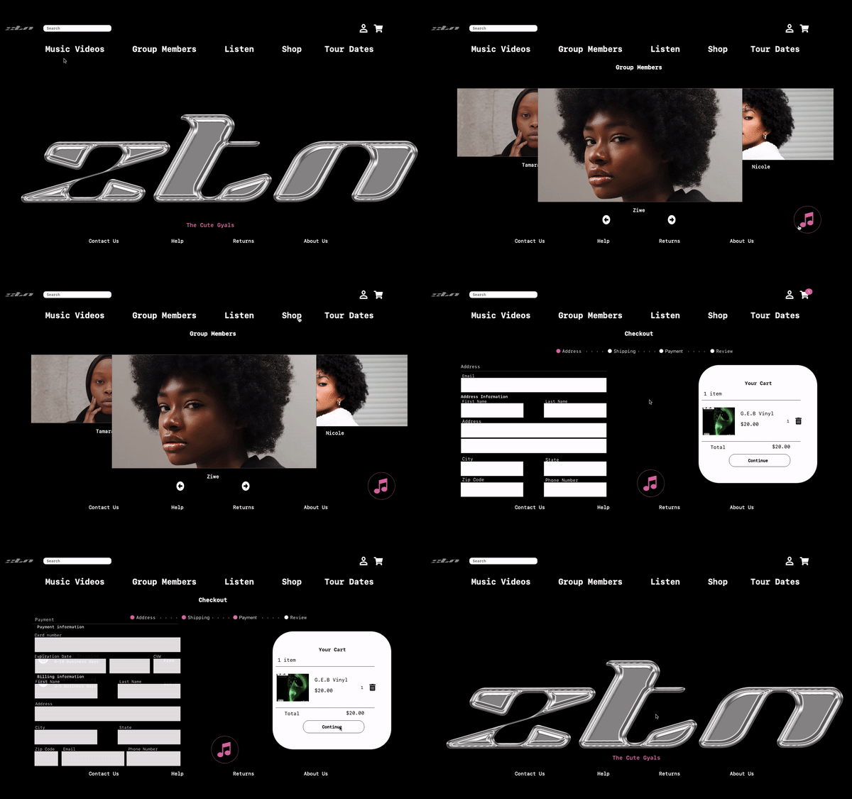
After the usability study, users wanted to go back to the homepage after completing the order or throughout their user journey. I decided to add the logo at the top page as a homepage button and included a button for the homepage at the end of checkout.
After the usability test, users stated they wanted to listen to music on the go and to change it with ease. I decided to include a music player icon that users can tap in order to change the music they’re listening to on any page.
Final Mockups
These are the final mockups of both the desktop version and the mobile version. The focus on this project was to create responsive A1, so I had to make sure that the ratios for the mobile version of the site were concise and clean just like the desktop version.
High-Fidelity Prototype
The final high-fidelity prototype presented cleaner user flows for listening to music, ordering merchandise and checking out. It also allows users to head back to the homepage at anytime and to change music at anytime.
View ZTN high-fidelity prototype
Conclusion:
I’ve learned that not only do designs need to be clear and concise with users, it also needs to be engaging and captivating for users to come back to the site multiple times, especially for creatives trying to promote their work. Simple action commands, accessible colors and fonts, yet creative design can really elevate your website and make it special.
Take Aways:
My next steps would be to conduct another round of usability studies to validate whether the pain points users experienced have been effectively addressed and to conduct more user research to determine any new areas of need.


