North Star Health App
Role in Project:
Lead UX designer
UX Researcher
Goal of Project:
Design an app that will teach young adults affordable healthy habits from nutrition to mental health to finding local doctors all on one site.
Target Audience:
Users who are young adults that want to practice healthy habits but don’t know where to start
Key Challenges:
Time constraints: Entire project was completed in two weeks
Being able to allow users to book doctor’s appointments on the app
creating a responsive website to go along with the dedicated mobile app
Pain Points:
Paint Point 1:
Users want to learn more about healthy habits but don’t have the time to sit down and read full articles at home
Pain Point 2:
Users want to have an app that covers all the topics on mental health to sexual health
Pain Point 3:
Users want to book appointments and chat to people who are experiencing similar events like the user
Personas
Problem Statement
Tamara is a stressed out graduate student and bartender who needs a tool that can help her with her mental health and provide relationship advice because she wants to maintain good relationship with her peers and not burn herself out.
User Journey
I created a user journey map of Tamara’s using the site to help identify possible pain points and improvement opportunities.
Problem Statement
Sean is a busy intern and college senior who needs a tool that can provide him workout routines, tips on eating healthy, and alerts because even though he’s still wants to stay healthy.
User Journey
I created a user journey map of Sean’s using the site to help identify possible pain points and improvement opportunities.
Problem Statement
Alex is a busy full time student and part time worker who needs an easy way to search for affordable skincare products on the go because he wants to save money, time and improve his skin.
User Journey
I created a user journey map of Alex’s using the site to help identify possible pain points and improvement opportunities.
Problem Statement
Morgan is a freshman that doesn’t know much about sexual health who needs a tool that can look up doctor’s in her area, find tips on sexual health and use chat forums because she wants to learn more about her body without feeling judged.
User Journey
I created a user journey map of Morgan’s using the site to help identify possible pain points and improvement opportunities.
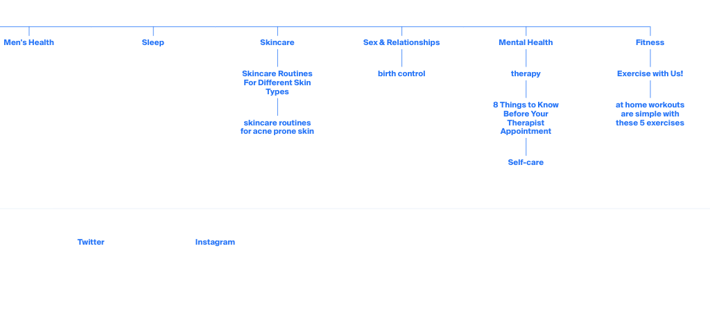
Site Map
The goal here was to make sure the website navigation is simple for all users and that they are able to go to any subcategory no matter what section of the website they are on.
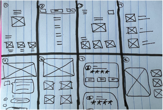
Ideation
I did a quick ideation exercise to come up with ideas for how to address gaps identified in the competitive audit. My focus was specifically on being able to book doctor’s appointments.
Research Conducted
1 unmoderated usability study
5 participants, between ages 18-25, users who want to maintain healthy habits and learn more about health but struggle to do so
Asked users to book an OB-GYN appointment, read skincare articles, and watch workout videos
Digital Wireframe: Usability Study
Nutrition page wireframe vs. nutrition page mock up that includes “healthy Recipes”
After the usability study, I found out that users were confused on where to locate the healthy recipes section on the North Star App. So I decided to change the “healthy Eating” and “Meal Prep” to “Healthy recipes to make it easier for the users to follow.
Exercise with us wireframe vs Exercise with us mock up page with workout routine video
After the usability study, I found out that users didn’t like the gif and text format on the workout page. Users stated that they would like full video workout routines, so they don’t have to scroll and read while working out. I updated the page to just show full videos instead.
skin care routine wireframe vs skincare routine mock up with products
After the usability study, I found out that users wanted to see products and know the order of the skincare routine all on one page. I went ahead and added pictures of each product that varies in price, while placing the prodcuts in the order of the skincare routine.
Final Mock Ups
High-Fidelity Prototype:
The high-fidelity prototype followed the same user flow as the low-fidelity prototype, including design changes made after the usability study.
View the North Star Health high-fidelity prototype.
Responsive Design
The designs for screen size variation included mobile, tablet, and desktop. I optimized the designs to fit specific user needs of each device and screen size.
Conclusion
I learned that even though the problem I was trying to solve was a big one, diligently going through each step of the design process and aligning with specific user needs helped me come up with solutions that were both feasible and useful. Users shared that the app made learning healthy living habits seem like easy and actually interesting task to do. One quote from the peer review feedback was that “I wish this app was real, I could have used this my freshman year of college, could have made better choices with this.”
Next Steps
Conduct research on how successful the app is in reaching the goal of booking appointments
Add more educational resources for users to learn about skin care routines for different skin types.
Provide incentives and rewards to users for booking appointments and participating in chat forums.


