SAPPHIRE CAFE APP
Role in project:
Lead UX designer
UX Researcher
Goal of Project:
Design an app for the Sapphire Cafe food truck that allows users to order food online and track their orders.
Target Audience:
Commuters and Busy workers don’t have time to prepare food or wait in line all day for their orders.
Key Challenges:
Time constraints: Had to complete this project in two weeks
Creating a food tracker at the end of user’s journey
Pain Points:
Paint Point 1
Workers don’t have the time or energy to cook meals at home.
Paint Point 2
Buying groceries to cook everyday can be pricey for many people.
Paint Point 3
Some food trucks don’t provide a proper website or app to order food on the go.
Paint Point 4
Some ordering apps make it visually hard to understand the user flow of ordering food.
Persona
Problem statement:
Stephanie is a busy film intern who needs a way to order food ahead of time after work for her and her boyfriend
because the line at the food truck takes too long and some food is gone when she gets there.
User Journey Map
Mapping Stephanie’s user journey revealed how helpful it would be for
users to have access to a dedicated Sapphire Cafe app.
Paper Wireframes
Research Conducted
2 unmoderated remote usability studies (lo-fi and hi-fi prototypes)
5 participants, between ages 18-65 who reside in Atlanta area, order pick-up at least twice a week
Users were asked to complete a food order and check out on the lo-fi prototype and the hi-fi prototype
Digital Wireframe: Usability Study 1
Before the usability test, the original wireframe required users to tap the squares, then a second screen pops up to ask how many items the user wants. After the usability test, many users stated that they wanted to place multiple items in their cart, and leave customer notes for their orders all on the same page. So I decided to do a list form for the items, revised the menu so that way there was also a detailed description of the food item and allowed users to complete multiple task all on one screen.
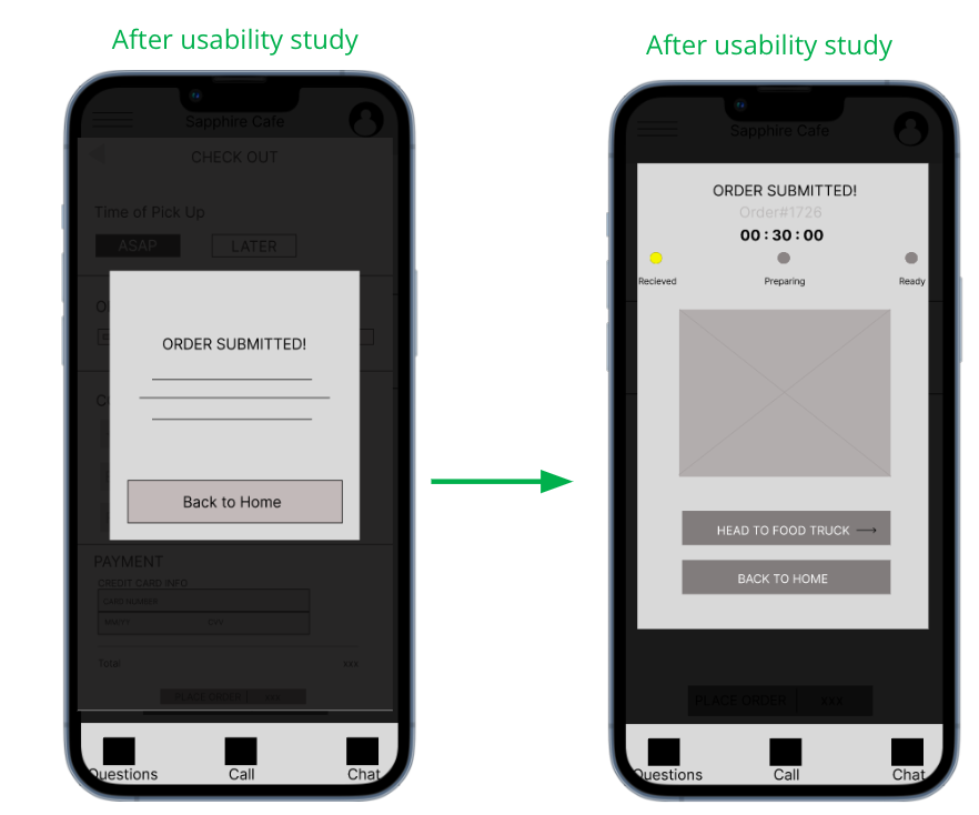
Before the usability test, the original wireframe had the “order submitted” screen and a “back to home”. After the usability test, users stated that they would like a food tracker at the end of checkout. So I added the food tracker screen and a button that can send users to the food truck location.
Mocks Ups: Usability Study 2
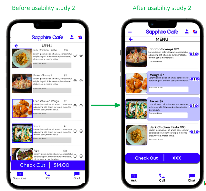
Once I created my mockups and created my hi-fi prototype, I conducted a second usability study to see what more improvements I could make. Majority of the participants revealed frustrations with the fonts and being able to clearly see which food item was selected. To fix this situation, I decided to use bold sub-headers, easy to press buttons, and highlighted the entire food section whenever someone tapped the food item. I also used a font that would be easy to read for users.
Final Mockups
High-Fidelity Prototype
The final high-fidelity prototype presented cleaner user flows for ordering food and checking out. It also met user needs for a tracker and easy to read fonts.
View the Sapphire Cafe App High-fidelity prototype
Conclusion
I’ve learned that the design process for apps goes through a lot of iteration from paper wireframes all the way up to high-fidelity prototypes. With this being my first ever UX design, I was taught new skills that will help me with future designs and I now understand the UX research process since I had to do all aspects of the of the project on my own. It’s important that we create the best version of the app and that is accessible for all users.
Next Steps
My next steps would be to conduct another round of usability studies to validate whether the pain points users experienced have been effectively addressed and to conduct more user research to determine any new areas of need.


